Film
Trainspotting
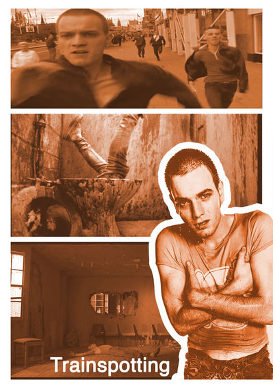
For the project film we were asked to pick a film from a list to make posters for and created our project around. I decided to pick the film Trainspotting by Danny Boyle, which is one of my favourite films. its about a group of friends who all happen to be heroin addicts in 90's Edinburgh. I chose this film because I love the story and creative visuals used by Danny Boyle to show what drug abuse is like without glorifying it which makes it really inspiring for film poster designs.
Mondo
Artist research
for the film project I decided to look at the work of Mondo. Mondo is a design studio where lots of different designers design and illustrate well known and intricate movie posters. I did two studies of the Artists work using photoshop brushes and a Macomb drawing tablet. I chose Star Wars poster for the background of my artist research because I like the use of the silhouette and I chose the invisible man to do a more in depth study because I love the use of light and dark in the original poster.
little
White
Lies
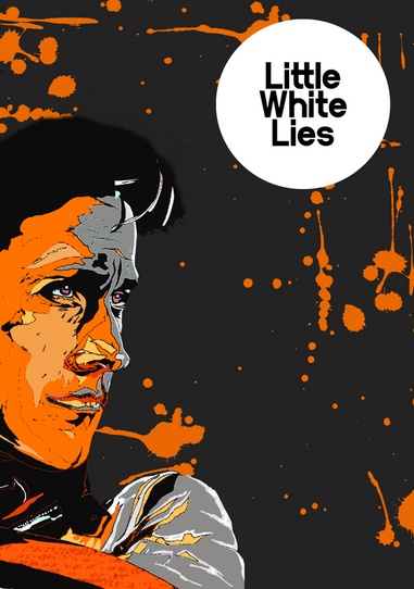
I chose little white lies because they are known for their beautifully illustrated film publications that set the tone of the film and grab audiences attention. some create a surreal effect withe their colour palette . I would like to combine mondo's and little white lies' style in my own designs with high quality emotive illustration with fluid lines bright and dark colours.
Aesthetic research
Illustration
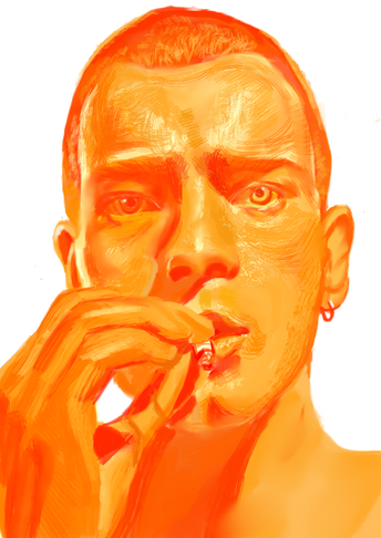
after looking at Mondo's work I knew I wanted to include my own illustrations in my poster. I decided to draw Mark Renton who is the main Character because he is such a big part of the film and why its so Iconic. I dint want the illustration to be very realistic and keep it quite loose and surreal to fit the tone of the film but I also wanted it to convey a lot of emotion and character like mondo does, so I tried to strike a balance between the two bye giving it lots of tone and texture but with unusual brushes which I think give an interesting effect I chose orange because of Keith Hillen, I like his use of orange against dark backgrounds and think the colour fits the tone of the film well. I then illustrated a syringe not for my own enjoyment of course but to highlight the film is about heroine addiction to give the viewer an idea of what the film is about.
Photo
graphy

at the weekend I went to Manchester to take pictures for the project. I decided I wanted pictures of graffiti and urban decay that suggest underlying drug use in the city. most of the photos are taken in the northern quarter and Ancoats because I love the architecture and the street art and also some dangerous places not far from the bustling city centre.i edited some black and white to me them more coherent and together and levelled them to make them pop and I'm really happy with the end result
before stating my posters I decided to expose branding. famous films have logos that are identifiable like Harry Potter, so I decide to experiment with different fonts that gave me a 90's vibe or fit the tone of transporting . I used fonts like Helvetica which I think is a timeless font and fits any design well and bebas neue is bold and eye catching and not to modern.i liked elastic because it goes from bulky to thin and I think its fits the idea of changing your life like the characters in transporting try to do. I experimented with betas neue inside a rectangle which I had eroded with a erasor which I really like because it gives a decayed urban effect like in my photography.the last font is blatant and I really liked it because I like the way you have the option to change the mode of the lettering to be wide and condense and I got a really nice 90's feel from it bu without it looking to dated to be in a modern poster today.
Branding
Posters
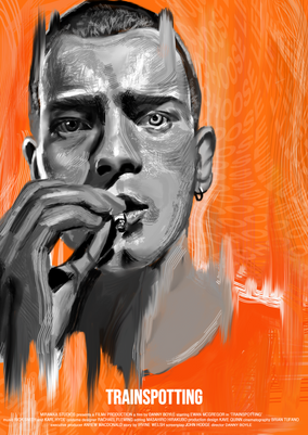
whilst I was waiting to be able to take photographs I made 3 posters incorporating my own illustrations. I decided to make them all match in the colour platte to tie them all together so I went for oranges and greys to link back to my aesthetic research of Keith hillen. I didn't want my designs to look exactly like Keith Hillen's work and I wanted them to show my style of illustration so I featured the tag line of the film "choose life" and copies and pasted it over and over and then liquified it to created a similar pattern which he uses in his work and I liked it because it looked quite trippy iek some of the imagery in the film so I used it on text and lines in my other designs . the 2nd design I used the same illustration but I wanted to give it a sort of grunge look so I eroded the drawing and added more texture .the 3rd design is inspired a lot by mondo in the style I illustrated the skull made by the flow of the heroine and I added the lines to give the drawing more flow and depth and I think it looks quite effective hopefully.the forth design I was finally able to include my own photography so id decided to feature on of my favourites from the shoot and decided to give it a more modern look but still trying keep the 90's look and it kind reminds me of a 90's band poster and because the film is centre around a great sound track I like the style of it a lot. doing the branding helped me identify on which text would fit each design and I like the way each looks and I hope. created more designs like these soon.


